Which Font is The Best to Use for Email Marketing?
Whether you’re interested in graphic design or not, the design of newsletters you receive will decide whether you throw them in the trash. In the making of an email, fonts play a huge role. 70% of readers will delete your email within 3 seconds if it’s hard to read and if it’s badly displayed or formatted.
Many things will affect your emails but today, let’s focus on something as simple as your fonts, but it’s not necessarily easy to choose them, and that’s why we’re here to help you!
Fonts will, just like colors, images, and shapes, set a mood for your emails. So it’s important to do this right. They come in different weights and sizes. Some look more formal whilst others look childish. Choose wisely so you don’t end ut with an email written in Comic Sans MS but contains information about your latest partnership for example. What font you use will set your company’s image.
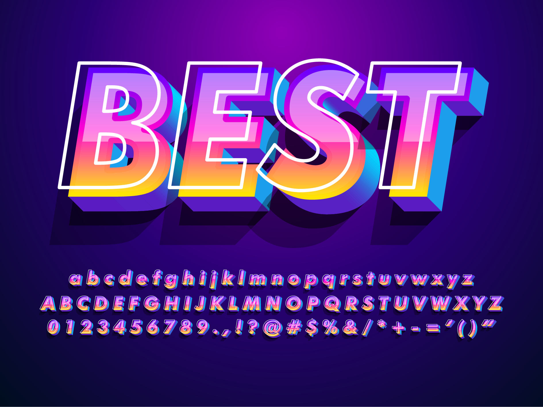
When it comes to choosing fonts, it’s a jungle, but a jungle of fun if you ask us! There are so-called families to choose from, there are San Serif, Serif, Script, and Decorative fonts.
Serif fonts are the ones with decorative strokes at the end of each letter. They’re old-fashioned and considered formal.
Sans Serif fonts are fonts that don’t use strokes at the end of each letter. These types of fonts are the most used, over 80% of Americans choose Sans Serif over Serif fonts. These fonts are also considered formal.
Script fonts look like handwriting and are inspired by calligraphy. They are not recommended for emails and in small, long texts. Due to their elegance, they’re nice for headings.
Decorative fonts are considered fun fonts. Used for exactly what they’re named after, decoration. They’re trendy and can liven up your design. Although, these fonts, just like script fonts, don’t go well in small, long texts.
When designing an email, your fonts will either be in your computer’s system, called system fonts, or they’ll be hosted on your email provider’s server, so-called web fonts.
Your system fonts are web-safe fonts, which means that you’ll have a guarantee that they’ll be visible on all devices. Although they’re considered boring, these are the safest to use. With web fonts, you’ll have more options but you risk having weird-looking emails if all devices don’t support them. If you want to use web fonts, there is something called fallback fonts. Fallback fonts are alternate fonts if your web fonts aren’t supported for the receiver. Fallback fonts are the most common fonts, for example, Arial and Times New Roman.
So what is the best font to use? According to some tests, we have made a list for you!
- Arial – Sans Serif
This font is common and used for print and digital media. It’s a font that doesn’t stick out but gives your email a good and formal look. You wouldn’t react badly to this font.
- Verdana – Sans Serif
This font was designed for screen displays, by making it easy to read, with appropriate spacing between the letters. This font is good for writing the body of your email.
- Georgia – Serif
Georgia is a font often used in newspapers and magazines. Serifs are often used to create an easy-to-read text. This font was designed to be appropriate for long texts.
- Helvetica – Sans Serif
This font will be your best choice for headings and logos due to its ability to look good in bold. The letters are quite close together and therefore this font should not be used for body texts.
- Tahoma – Sans Serif
Tahoma gives a clean, formal look due to the similar lengths of both upper and lower case letters. As well as Verdana, this font was designed for screen displays.
- Times New Roman – Serif
I bet you’ve heard about this font, and that is for a reason. It’s the most popular font of all time. Designed by Times Newspaper, this font makes your emails look professional and classic. Although, you should use this just for headings because it can be hard to read in longer texts.
- Open Sans – Sans Serif
Open Sans is also a popular font, with views of over 11 trillion. It gives a friendly vibe and is good for digital content. This font comes in 10 different weights.
- Roboto – Sans Serif
Another font designed for screen display is Roboto, a very popular Google Fonts. This is a font perfect to use for both body and headings.
- Raleway – Sans Serif
With 18 different weights, Raleway is also popular and has a total of almost 1 trillion views. This font is hosted on the web and gives an elegant touch with its thin letters. This is a font you can use for all sorts of text thanks to the variety of weights.
- Lato – Sans Serif
Lato has rounded letters that are good for your long texts and give your emails a natural look. This font is also hosted on the web.
Now that we’ve gone through all the best fonts, why not list the worst fonts to use? If you’re having a hard time choosing a font, the best way to decide is to use the exclusion method. So here follows a list of the three worst fonts to use for your emails.
- Comic Sans MS
This font is highly associated with a child’s handwriting and is often used for the targeted audience of children. Using this font in business emails is therefore a big no.
- Curlz
Like Comic Sans MS, this font is a very immature choice of font. Choosing this will only make you and your brand seem very unprofessional. The design of this font is extremely disturbing and only makes it hard to read.
- Trajan
Even though this font can be used for things like posters, it’s not recommended for business emails. This is because of its unprofessional look.
The world is full of different fonts and even though these fonts listed above are proven to be good or bad, there is so much more to explore that hasn’t been tested yet. The only way to figure that out is to explore all fonts, but meanwhile, stick to the top-ranked, they’re there for a reason, right?
You can also mix different fonts to spice it up even more!
So what are you waiting for, start designing and keep on experimenting with fonts!